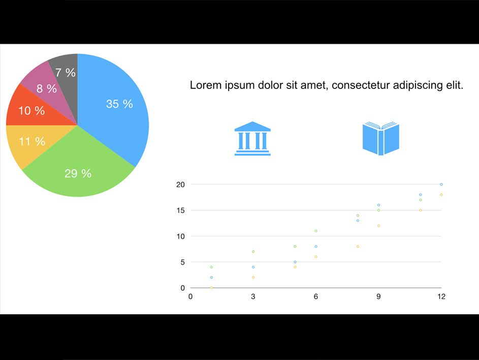
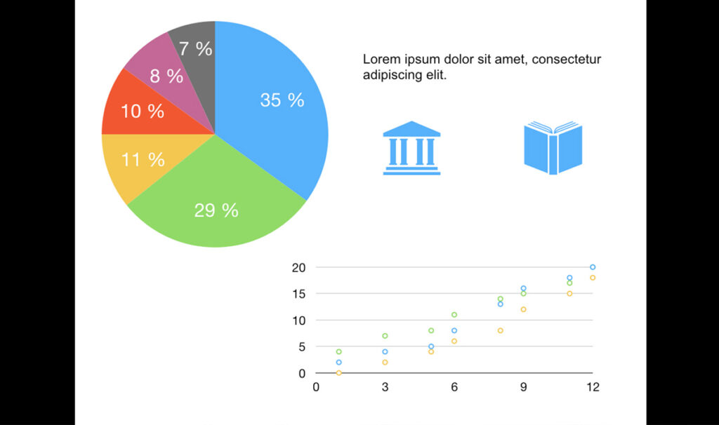
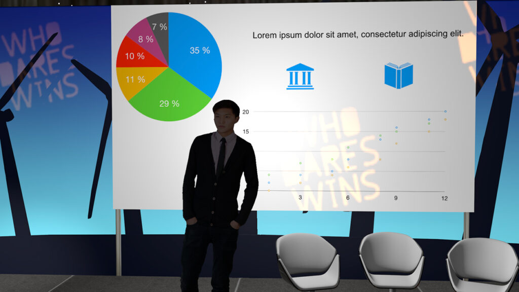
In the realm of presentations, whether it’s PowerPoint, PDF, Keynote, the aspect ratio is paramount: 4:3 or 16:9. Confirm with the room’s technician the projector’s aspect ratio and ensure presenters adjust their slides accordingly. While the traditional 4:3 ratio has been widely used, the rise of high-definition formats has made 16:9 increasingly popular. Understanding this ratio is crucial for recording or broadcasting, preventing the appearance of black bars on the top or sides of the screen due to mismatched resolutions.


16:9 Slide on a 4:3 Projector / 4:3 Slide on a 16:9 Projector
- Unified Presentations: If multiple presenters are sharing slides, it’s advisable to consolidate them into a single file on one computer, ensuring uniformity in aspect ratio (4:3 or 16:9). Managing multiple laptops with different connectivity options (VGA, HDMI, Display Port, DVI) can lead to chaos and signal issues. If unification isn’t feasible, ensure all slides are displayed from a single computer to avoid signal disruptions.
- Post-production Flexibility: In case slides need post-production editing, opt for open formats like PDF, JPG, PNG, followed by PPT or KEY, while avoiding closed formats like Prezi. If the presentation includes videos or animations, consider converting it into a video file for easier editing or ensure separate video files are available for integration.
- Starting and Ending Slides: Recommend presenters to include introductory and concluding slides for coherence and professionalism.
- Avoiding Projector Beam: Advise presenters to avoid standing in the projector beam to prevent obstruction and shadowing on the screen.
- Laser Pointer Usage: Note that laser pointer markings won’t be visible in the broadcast. Encourage presenters to verbally reference specific points on slides for the benefit of both online and in-person audiences.
- Font Size and Style: Opt for font sizes and styles that are legible from a distance to ensure clarity for all viewers.
- Room Lighting: Ideal settings involve a slightly dimmed room to enhance slide visibility while keeping the podium well-lit for presenter visibility. Dark backgrounds are preferable for reducing eye strain, especially when the room can be dimmed slightly, but not excessively.
- Presenter Positioning: If using dark backgrounds, suggest presenters stand in front of the projector to annotate without being overly illuminated. Ensure they avoid blocking the screen at all costs.

Situation where the camera iris or shutter is focused on the presenter. The projector is overexposed.

Situation where the camera iris or shutter is focused on the presentation. The presenter is underexposed.
- Practice Makes Perfect: Encourage presenters to rehearse their presentations beforehand to ensure smooth delivery.
- Monitor Placement: Position a screen in front of presenters displaying the current slide to prevent them from turning their backs to the audience and the camera.
- Audio Integration: If the presentation includes sound, ensure the audio output is routed to the sound mixing desk.
- Dual Screen Setup: Enable dual-screen mode on the presenting computer, allowing presenters to see their slides and notes while the audience views the full-screen presentation.
- Quiet Remote Controls: Utilize remote controls with quiet buttons for seamless slide transitions without distraction.
- Unobstructed Presenter: Ensure the presenter’s face isn’t obscured by a computer screen during the presentation.
In conclusion, ensure presenters adhere to your guidance for optimal presentation quality, as your efforts are aimed at enhancing their performance.
Tired of juggling multiple tools? Inefficient video worklfow?
Say no more. Lean how Quickchannel can help you improve your video production.


